New Look, Same FreeForm
Greetings, coffee lovers!
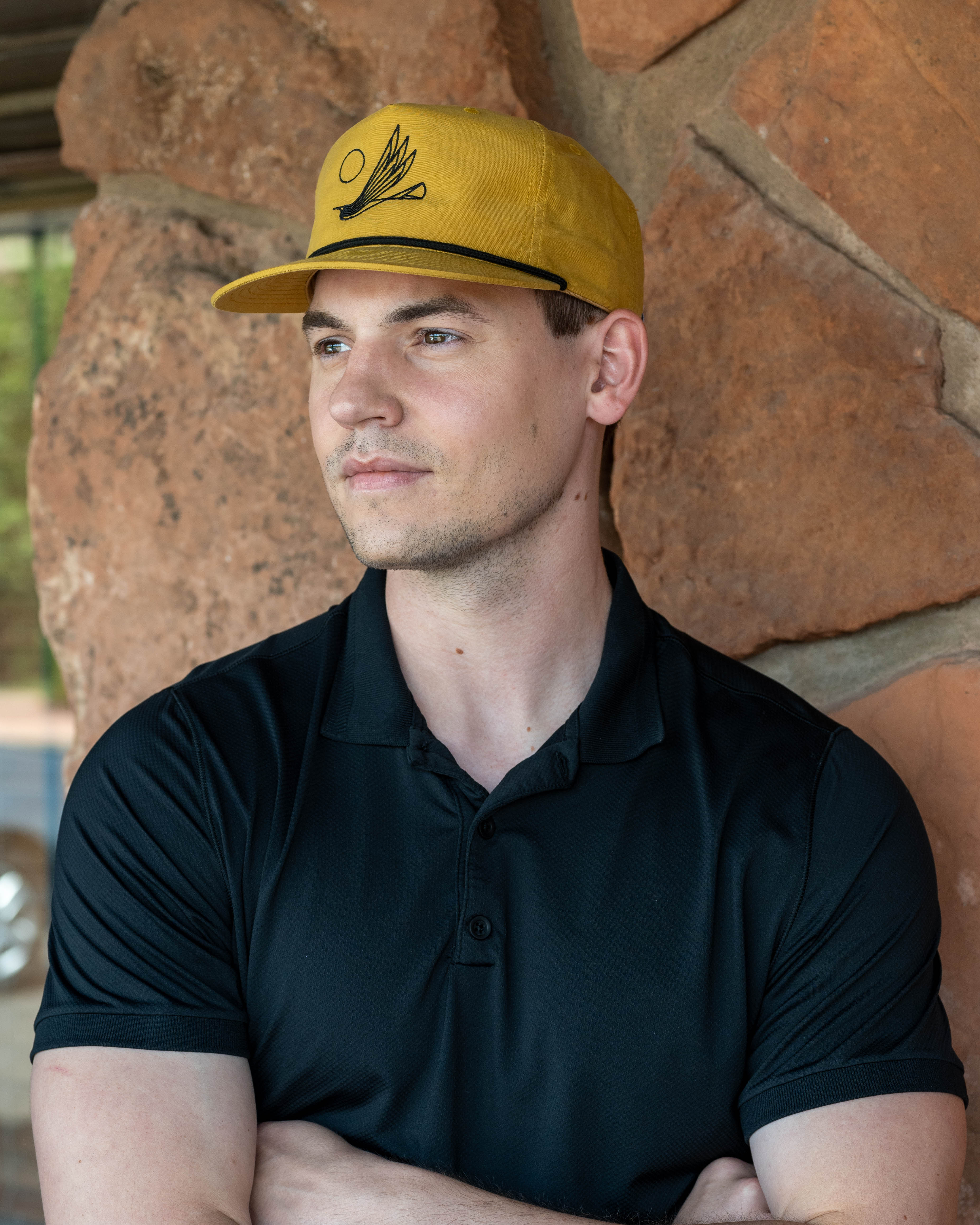
Over the past couple of months, you may have noticed a subtle evolution of our brand aesthetic online - an updated logo, new fonts, and a refreshed color palette. Starting in May, that shift continues with our packaging: the coffee arriving in your mailbox or on the shelves at our café will feature our updated bags and labels. We wanted to take a moment to share a bit about what’s behind this brand refresh.
The past year has brought a lot of growth and change here at FreeForm. We planned, built, and moved into a brand-new roasting facility, giving us more space and a more efficient workflow (more on that soon!). Our retail café continues to welcome both Sedona locals and curious visitors, and we’ve made big strides in our systems and training - resulting in a team of baristas with both serious skill and genuine passion.
On the product side, our green coffee sourcing has deepened and matured. We’ve built lasting relationships with producers, many now annual traditions, and strengthened our commitment to quality, innovation, and sustainability.
Frankly, after nearly five years of FreeForm, we feel like we’re beginning to truly understand who we are - what we value, where we fit in the coffee world, and what we want to contribute to the conversation. With all of that in mind, this felt like the right time to refresh our visual identity to better reflect who we’ve become and the incredible regional community that’s helped us get here.

A Tribute to Place
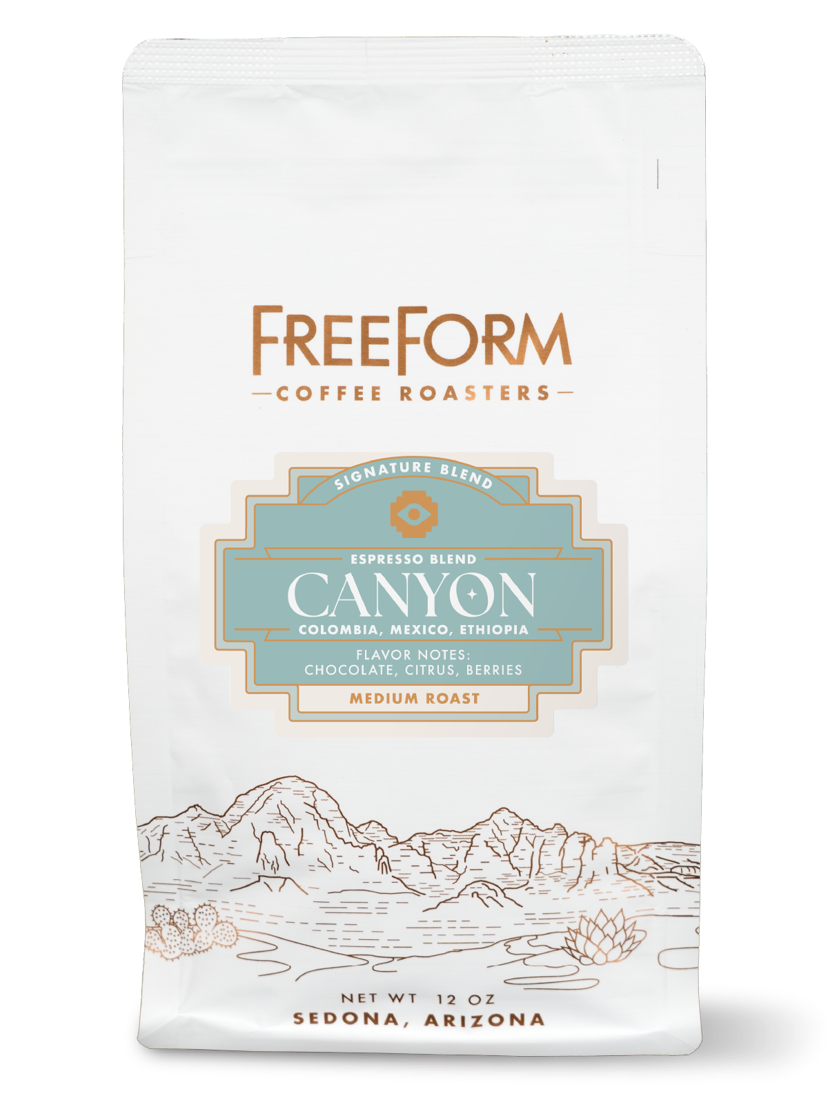
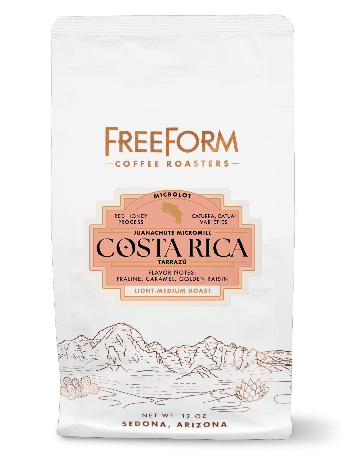
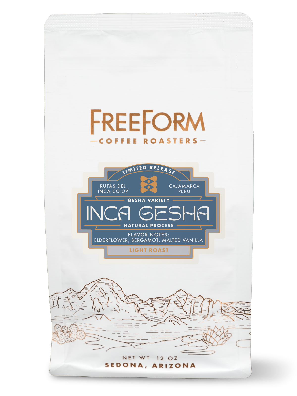
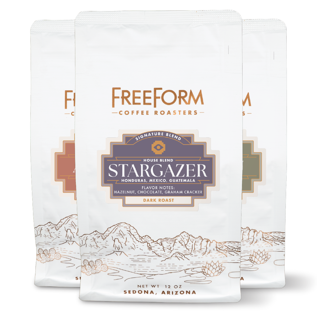
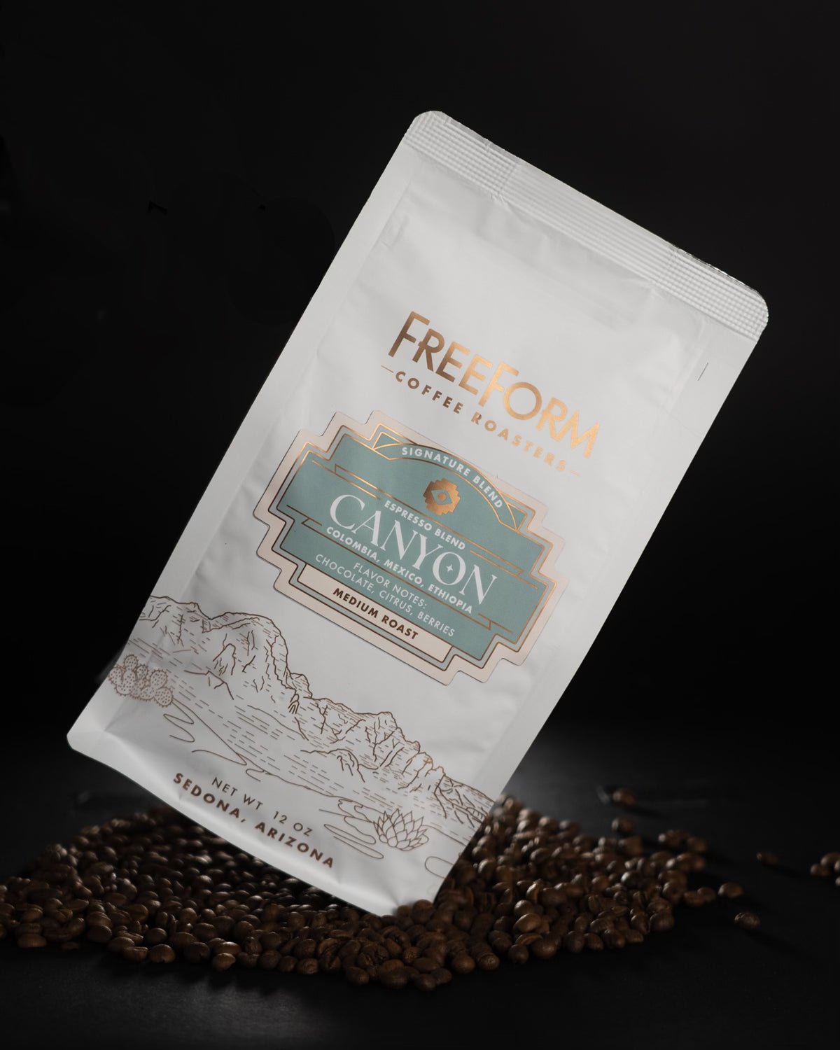
The first thing you’ll notice is the bag itself. Gone is the plain white package - in its place, a wraparound landscape illustration inspired by our home in Sedona. We’ve long felt it was time to pay tribute to the landscape that inspires so much of what we do, and now every bag carries a bit of that spirit with it.
A New Chapter for Labels
Our labels have always been a creative outlet, a fun and flexible space for visual expression. But designing custom artwork for each new release was time-intensive—sometimes delaying releases or discouraging us from offering more coffees than we otherwise might. We wanted to keep the creativity alive while bringing more consistency to the visual experience - and making the process more efficient.
Drawing from our Southwestern roots (and the beautiful historic building our café calls home), we developed a new stepped rectangle shape for the labels. From there, we created a system of color-coded categories designed to clearly communicate the flavor style of each coffee.
Introducing Our Flavor Profiles
Rather than dividing coffees by “blends vs. single origin,” we’re now organizing them into three flavor-driven categories: Classic, Curious, and Eclectic.
-
Classic coffees feature warm, earthy label colors drawn from the desert Southwest. These are dependable, comforting blends—“coffee coffees”—roasted medium to dark with familiar notes like chocolate, nuts, caramel, and dried fruit.
-
Curious coffees have an off-white label and are focused on origin. These are traceable, seasonal single origin coffees that highlight the character of their region and processing. Roasts range from light to medium, with the goal of letting the coffee itself shine.
-
Eclectic coffees are where things get adventurous. These limited releases feature unique microlots, experimental processing, and wild flavor profiles. You’ll see more playful and unexpected design elements here, paired with lighter roast levels to showcase clarity and nuance.
At the end of the day, it’s always about what’s inside the bag. But we hope these intentional updates add to your experience, offering a little more clarity on what to expect and a stronger sense of who we are and where we’re coming from.
A Word of Gratitude
We would be remiss if we didn't acknowledge the hard work, patience, and incredible talent of Andy Reiland, who has been the real artist behind FreeForm's brand identity since day one. Andy is a multi-talented and successful creative professional with his own firm, Reiland Creative, based in Milwaukee, Wisconsin (but a frequent desert explorer and lover of Sedona). Thank you Andy!
Thank you for being part of this journey with us. We’re excited for what’s ahead.
Warmly,
Daniel + Monica

Leave a comment
All comments are moderated before being published.
This site is protected by hCaptcha and the hCaptcha Privacy Policy and Terms of Service apply.